
Basic Statistics and Timeseries with pandas
This post is mostly just a refresher course for myself in how to perform basic statistics in Python. Also, I’m currently playing around with pandas, which is pretty much awesome for data analysis.
Basic Statistics
We’ve got to start somewhere, so why not start with the theoretical basics: random variables, means, variances, and correlation.
First, the multivariate random variable (also called a random vector):
Every random variable can be characterized by a special function called a joint distribution function:
A closely related function is the joint probability density function. This function differs for continuous random variables (defined on a continuous sample space) and discrete random variables (defined on a countable sample space). For continuous random variables, the density function is:
The two functions are related by:
For discrete random variables, we get similar equations. The density function for discrete random variables is:
And it is related to the distribution function by:
Distributions can have any number of what are called moments. The most relevant moments are the mean (first moment) and the variance (second central moment). They are defined in terms of an expectation operator
For a discrete random variable, the mean is:
The variance is then:
By extending these concepts to the realm of multivariate random variables we get the vector mean:
And the covariance matrix:
Where
Finally, we can define the correlation of two random variables:
And the correlation matrix for
Python Code
Doing statistical work in Python is very easy, assuming you know which tools to use. Of course, there are dozens of excellent Python packages to choose from. At a minimum you’ll want to have NumPy, SciPy, matplotlib, and pandas available.
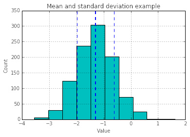
Let’s do some basic mean and standard deviation calculations.
import pandas as pd
import numpy as np
from matplotlib import pyplot as plt
s = pd.Series(0.7 * np.random.randn(1000) - 1.3)
s.hist(color='c')
mean = s.mean()
std = s.std()
plt.axvline(mean, color='b', linestyle='dashed', linewidth=2)
plt.axvline(mean-std, color='b', linestyle='dashed', linewidth=1)
plt.axvline(mean+std, color='b', linestyle='dashed', linewidth=1)
plt.title('Mean and standard deviation example')
plt.xlabel('Value')
plt.ylabel('Count');
To calculate covariance and correlation we can do:
df = pd.DataFrame(np.random.randn(50, 3), columns=['a', 'b', 'c'])
df.cov()
| a | b | c | |
|---|---|---|---|
| a | 1.446393 | -0.053009 | 0.178310 |
| b | -0.053009 | 1.110589 | 0.003758 |
| c | 0.178310 | 0.003758 | 1.118477 |
df.corr()
| a | b | c | |
|---|---|---|---|
| a | 1.000000 | -0.041825 | 0.140191 |
| b | -0.041825 | 1.000000 | 0.003372 |
| c | 0.140191 | 0.003372 | 1.000000 |
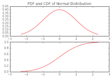
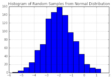
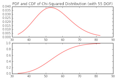
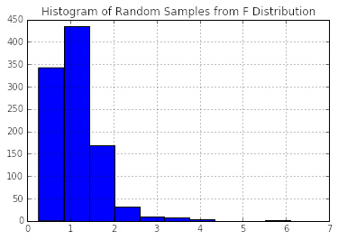
Many times it is necessary to generate random numbers according to a particular distribution function. SciPy and NumPy make this easy. The following demonstrates how to generate PDF’s, CDF’s, and random numbers on normal, chi-squared, Student’s t, and F distributions.
from scipy.stats import norm
fig, (ax1, ax2) = plt.subplots(2, 1)
x = np.linspace(norm.ppf(0.01), norm.ppf(0.99), 100)
ax1.plot(x, norm.pdf(x), 'r-', lw=2, alpha=0.5)
ax2.plot(x, norm.cdf(x), 'r-', lw=2, alpha=0.5)
ax1.set_ylim((0,0.45))
ax1.set_title('PDF and CDF of Normal Distribution');
pd.DataFrame(np.random.normal(-2, 1.2, 1000)).hist(bins=16)
plt.title('Histogram of Random Samples from Normal Distribution');
from scipy.stats import chi2
df = 55
fig, (ax1, ax2) = plt.subplots(2, 1)
x = np.linspace(chi2.ppf(0.01, df), chi2.ppf(0.99, df), 100)
ax1.plot(x, chi2.pdf(x, df), 'r-', lw=2, alpha=0.5)
ax2.plot(x, chi2.cdf(x, df), 'r-', lw=2, alpha=0.5)
ax1.set_title('PDF and CDF of Chi-Squared Distribution (with {} DOF)'.format(df));
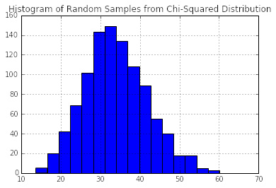
pd.DataFrame(np.random.chisquare(34, 1000)).hist(bins=16)
plt.title('Histogram of Random Samples from Chi-Squared Distribution');
from scipy.stats import t
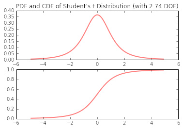
df = 2.74
fig, (ax1, ax2) = plt.subplots(2, 1)
x = np.linspace(t.ppf(0.01, df), t.ppf(0.99, df), 100)
ax1.plot(x, t.pdf(x, df), 'r-', lw=2, alpha=0.5)
ax2.plot(x, t.cdf(x, df), 'r-', lw=2, alpha=0.5)
ax1.set_title('PDF and CDF of Student\'s t Distribution (with {} DOF)'.format(df));
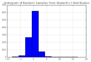
pd.DataFrame(np.random.standard_t(2.8, 1000)).hist()
plt.title('Histogram of Random Samples from Student\'s t Distribution');
from scipy.stats import f
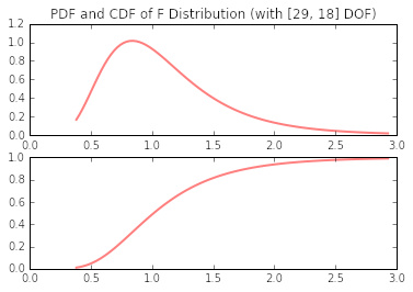
dfn, dfd = 29, 18
fig, (ax1, ax2) = plt.subplots(2, 1)
x = np.linspace(f.ppf(0.01, dfn, dfd), f.ppf(0.99, dfn, dfd), 100)
ax1.plot(x, f.pdf(x, dfn, dfd), 'r-', lw=2, alpha=0.5)
ax2.plot(x, f.cdf(x, dfn, dfd), 'r-', lw=2, alpha=0.5)
ax1.set_title('PDF and CDF of F Distribution (with [{}, {}] DOF)'.format(dfn,dfd));
pd.DataFrame(np.random.f(29, 18, 1000)).hist()
plt.title('Histogram of Random Samples from F Distribution');
Time Series
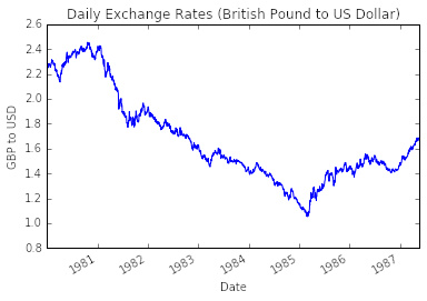
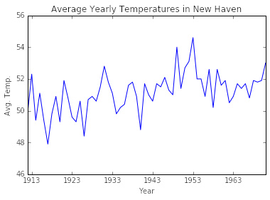
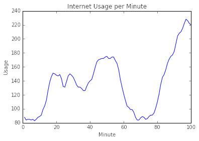
Now that we’ve covered the basics, let’s get started talking about time series. A time series is an ordered sequence of observations, sometimes called a signal. The ordering is normally through time, particularly in terms of equally spaced time intervals. Here are some examples (original source data found at vincentarelbundock.github.io/Rdatasets).
import pandas as pd
import numpy as np
from matplotlib import pyplot as plt

df_cur = pd.read_csv('data/Garch.csv', parse_dates=['date'], index_col='date')
df_cur['bp'].plot()
plt.ylim(0.8, 2.6)
plt.title('Daily Exchange Rates (British Pound to US Dollar)')
plt.xlabel('Date')
plt.ylabel('GBP to USD');
df_temp = pd.read_csv('data/nhtemp.csv', parse_dates=['time'], index_col='time')
plt.plot(df_temp.index, df_temp['nhtemp'])
plt.ylim(46, 56)
plt.title('Average Yearly Temperatures in New Haven')
plt.xlabel('Year')
plt.ylabel('Avg. Temp.');
df_www = pd.read_csv('data/WWWusage.csv', index_col='time')
plt.plot(df_www.index, df_www['WWWusage'])
plt.ylim(80, 240)
plt.title('Internet Usage per Minute')
plt.xlabel('Minute')
plt.ylabel('Usage');
Estimate Distributions and Densities
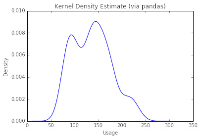
Given a data set, how do you to which particular distribution function is belows? Well, that can be a tough one. Fortunately, SciPy can generate an estimate for you, which you can then plot and visualize.
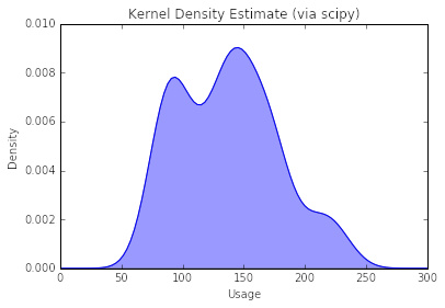
First, I’ll show the pandas shortcut method (single line of code). Following that is the more robust, SciPy method (more control).
df_www['WWWusage'].plot(kind='kde')
plt.title('Kernel Density Estimate (via pandas)')
plt.xlabel('Usage');
from scipy.stats.kde import gaussian_kde
kde = gaussian_kde(df_www['WWWusage'])
xspan = np.linspace(0, 300, 100)
pdf = kde(xspan)
plt.plot(xspan, pdf)
plt.fill_between(xspan, 0, pdf, alpha=0.4)
plt.title('Kernel Density Estimate (via scipy)')
plt.xlabel('Usage')
plt.ylabel('Density');
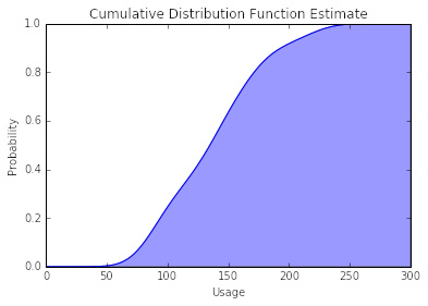
cdf = np.cumsum(kde(xspan))
cdf = cdf / max(cdf)
plt.plot(xspan, cdf)
plt.fill_between(xspan, 0, cdf, alpha=0.4);
plt.title('Cumulative Distribution Function Estimate')
plt.xlabel('Usage')
plt.ylabel('Probability');
Conclusion
That’s it for now. I’ve covered: some very basic math theory; how to calculate mean, covariance, etc.; how to generate random numbers; how to visualize densities and distributions; and a little bit on time series.
References
- Madsen, Henrik. Time Series Analysis. Chapman & Hall/ CRC, 2007.